Thông tin tài liệu:
Tham khảo tài liệu creating cool web sites with html, xhtml and css (2010)- p5, công nghệ thông tin, kỹ thuật lập trình phục vụ nhu cầu học tập, nghiên cứu và làm việc hiệu quả
Nội dung trích xuất từ tài liệu:
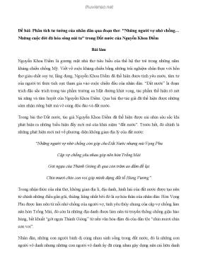
Creating Cool Web Sites with HTML, XHTML and CSS (2010)- P5 174 Creating Cool Web Sites with HTML, XHTML, and CSS The second table trick I want to demonstrate is using a table as a tool for developing the lay out of an entire page rather than an element within the page. For this, I call on another exam ple: a home page template for a small business site, built using tables. Tables as a Page Layout Tool .name { color: white; font-weight: bold; font-size: 110%; margin-top: 10px; } body { color: #336; font-family: sans-serif; } td { font-size: 90%; } Small Business International, Inc. Mission Approach Staff Links Home Small Business International, Inc. (“SBI”) is a strategy consulting and new venture development firm serving the global retail industry. The firm was founded in 1974 to assist US-based retail enterprises in realizing their international growth objectives and to capitalize onPlease purchase PDF Split-Merge on www.verypdf.com to remove this watermark. Chapter 8: Tables and Frames 175 emerging retail trends through the creation and financing of promising new ventures. A strategic focus: Japan. By now, every line of this example should make sense to you. Everything being used here has been explained earlier in the book, with the exception of margin settings in the CSS. A quick glance at Figure 8-12, and you can immediately see that this is how people create multiple column designs, like that used on the Microsoft home page (http://www.microsoft.com/), for example. x-ref I cover margin settings and other advanced aspects of CSS in Chapter 12. Figure 8-12: A nifty table-based page layout.Please purchase PDF Split-Merge on www.verypdf.com to remove this watermark. 176 Creating Cool Web Sites with HTML, XHTML, and CSS The hidden problem with this design, however, is that it’s explicitly designed for a standard VGA monitor resolution: 640 pixels wide. You can see that in the table width specification: If the user has a screen that’s considerably wider (800, 1024, or more pixels), a lot of unused blank space remains on the right side of the screen, and you can’t do much about it. One experiment that might give you good results is using relative widths at the top of the table, like this: You can then specify the exact size of the column you are working with, like this: With this method, you let the browser calculate the width of any other columns of data you might specify. This works reasonably well, but there’s a hidden gotcha if you have a screen that’s too small. It’s a problem that is present on the Small Business International page, too, if displayed on too narrow a screen. When you specify relative widths on a narrow screen, the browser sometimes calculates the width of a column to be narrower than the items within. The table of possible areas to explore on the SBI page can end up being resized and, as a result, its edge might actually overlap the main column of data, a very unacceptable result. To avoid the potential problem of overlapping columns, you can create a blank graphic that is the specific width of the widest element in the column plus a dozen pixels or so. You then include that as a hidden spacer element. If your table looks bizarre when you view it and you’re using a mix of specific pixel widths and percentage widths, try switching exclusively to pixel widths or percent- tip age widths. It’s ...

 Danh mục