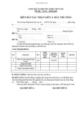
Thông tin tài liệu:
The Non-Designers Design Book- P7: So you have a great concept and all the fancy digital tools you could possibly require—whats stopping you from creating beautiful pages? Namely the training to pull all of these elements together into a cohesive design that effectively communicates your message. Not to worry: This book is the one place you can turn to find quick, non-intimidating, excellent design help.In The Non-Designers Design Book, 2nd Edition, best-selling author Robin Williams turns her attention to the basic principles of good design and typography. All you have to do is follow her clearly explained concepts, and youll...
Nội dung trích xuất từ tài liệu:
The Non-Designers Design Book- P7III Part 3: Extras Answers: Quiz #1 (page84) Remove the border to open up space. New designers tend to put borders around everything. Stop it! Let it breathe. Dont contain it so tightly! proximity The headings are too far away from their related items: move them closer. There are double Returns above and below the headings: take out all double Returns,but add a little extra spaceabove the headingsso they are more closely connected to the following material they belong with. Separate personal info from resume items with a little extra space. Alignment Text is centered and flush left, and second lines of text return all the way to the left edge: create a strongflush left alignment-all heads align with each other, all bullets align, all text aligns, second lines of text align with first lines. Repetition There is already a repetition of the hyphen: strengthen that repetition by making it a more interesting bullet and using it in front of every appropriate item. There is already a repetition in the headings: strengthen that repetition by making the headings strong and black. The strong black impression in the bullets now repeats and reinforces the strong black in the headings. Contrast There isnt any: use a strong, bold face for contrast of heads, including Resume (to be consistent, or repetitive); add contrast with the strong bullets. By the way: all the numbers in the new version are a point size smaller so they dont call undue attention to themselves. Answers: Quiz #2 (page85) Different typefaces: There are four different sans serifs (Helvetica, Avant Garde, Optima, and Formata Bold). There are two serif faces (Aachen Bold and New Century Schoolbook). Choose two of those: one nice strong bold (such as the Aachen Bold) and one sans serif. Different alignments: Oh my gawd. Some elements are flush left, some are centered, some are centered in the middle of empty space, some have no connection or alignment with anything else in the world. strong line: The graphic image of tiles could provide a strong line against which to align other elements. Lack of proximity: Group the information. You know what should be grouped together. Lack Of focal point: Several items are competing for attention. Choose one. Lack of repetitive elements: How about taking those bullets and making them stronger, including the bullet between tile and linoleum. Perhaps use a square bullet, to repeat the square tile. Repeat the bold face in the large phone number, since this is a phone book ad. Remove the border inside the border. Use square corners on the remaining border to reinforce the square corners of the tile and to keep the edges clean. TAKE OFF THE CAPS LOCKIII The example on the next page is only one of many possibilities! TWELVE: ANSWERS TO QUIZZES III Ancient City Draw lines along all the edges Tile and Interiors :. tl1atnow SantaAnasInteriorHeadquarters Contractors tothepublic prices Installation available ~ :~. ,,- align. Tile and Linoleum Talavera Saltillo Monterrey Dallas Ceramics Aztec Midstate Quality marble Large selection of tiles on display 982.7219 ~.~ 1776 Cupertino Road Monday-Friday8:30-5 (acrossfrom high school. next to Easy Print) Saturday 9 A.M. to noonAnswers: Oulz #3 (page139) Oldstyle: As I remember, Adam Sans serif: Its your attitude Modern: High Society Script: Too Sassy for Words Slabserif: The enigma continues Decorative: At the RodeoAnswers: Oulz #4 (page140) Answers: Oulz #5 (page 141) Giggle: B Diggle: C Jiggle: C Riggle: A Diggle: A Figgle: B Piggle: A Biggle: D Higgle: C Miggle: D Wiggle: B Tiggle: AlIB Part 3: Extras ...

 Danh mục