Thông tin tài liệu:
Nội dung của bài giảng trình bày biểu đồ phân bố geom histogram; điểm thi mô Toán; tuổi thọ của vài lãnh đạo; box plot geom boxplot; 5 yếu tố trong biểu đồ hộp; không nên dùng barplot để mô tả biến liên tục; biểu đồ tán xạ; scatter plot dữ liệu theo thời gian...
Nội dung trích xuất từ tài liệu:
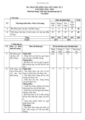
Bài giảng Hiển thị dữ liệu (Data visualization) Tuan V. NguyenSenior Principal Research Fellow, Garvan Institute of Medical Research Professor, UNSW School of Public Health and Community Medicine Professor of Predictive Medicine, University of Technology Sydney Adj. Professor of Epidemiology and Biostatistics, School of Medicine Sydney, University of Notre Dame AustraliaPhân tích dữ liệu và ứng dụng | Đại học Dược Hà Nội | 12/6 to 17/6/2019 © Tuan V. Nguyen Biểu đồ• Phân bố: histogram• Tần số: barplot• So sánh: boxplot• Liên quan: scatterplot Obesity data (Vietnam)• Cross-sectional study of obesity in Vietnam• Aim: to predict percent body fat (pcfat) by using gender, age, bmi. dat = read.csv(~/Dropbox/_Conferences and Workshops/TDTU 2018/Datasets/obesity data.csv) dim(dat) [1] 1217 11 head(dat) id gender height weight bmi age WBBMC wbbmd fat lean pcfat 1 1 F 150 49 21.8 53 1312 0.88 17802 28600 37.3 2 2 M 165 52 19.1 65 1309 0.84 8381 40229 16.8 3 3 F 157 57 23.1 64 1230 0.84 19221 36057 34.0 4 4 F 156 53 21.8 56 1171 0.80 17472 33094 33.8 5 5 M 160 51 19.9 54 1681 0.98 7336 40621 14.8 6 6 F 153 47 20.1 52 1358 0.91 14904 30068 32.2Histogram Biểu đồ phân bố: geom_histogram()• Mục tiêu: mô tả phân bố của dữ liệu• Có thể so sánh phân bố giữa 2 hay nhiều hơn 2 nhóm• Ví dụ: Phân bố của pcfat (tỉ trọng mỡ)dat = read.csv(~/Dropbox/_Conferences and Workshops/TDTU2018/Datasets/obesity data.csv)# Biểu đồ đơn giảnlibrary(ggplot2); library(gridExtra)p = ggplot(data=dat, aes(x=pcfat))p1 = p + geom_histogram(color=white, fill=blue)p = p + geom_histogram(aes(y=..density..), color=white, fill=blue)p2 = p + geom_density(col=red)grid.arrange(p1, p2, ncol=2)# Biểu đồ đơn giản 100 0.06library(ggplot2); library(gridExtra)p = ggplot(data=dat, aes(x=pcfat)) 75p1 = p + 0.04geom_histogram(color=white,fill=blue) density count 50p = p +geom_histogram(aes(y=..density..),color=white, fill=blue) 0.02p2 = p + geom_density(col=red) 25grid.arrange(p1, p2, ncol=2) 0 0.00 10 20 30 40 50 10 20 30 40 50 pcfat pcfat 100Phân tích theo giới tính 75 gender count 50 Fp = ggplot(data=dat, aes(x=pcfat, Mfill=gender)) 25p1 = p +geom_histogram(position=dodge) 0 10 20 30 40 50 pcfat 0.08p2 = ggplot(data=dat, aes(x=pcfat,fill=gender, color=gender)) + 0.06geom_density(alpha = 0.1) gender density 0.04 F Mgrid.arrange(p1, p2, nrow=2) 0.02 0.00 10 20 30 40 50 pcfat Điểm thi môn toán (2018)dat = read.csv(~/Dropbox/_Conferences and Workshops/TDTU 2018/Datasets/THPT2018 All Provinces.csv)> head(dat) ID Province Math Viet English Physics Chemistry Biology History Geography1 1 ...

 Danh mục